Buy the Counter Last: Designing the Square Metre That Does the Most Work
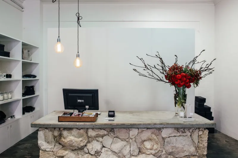
There is a moment near the end of most shop fit-outs when someone says, reasonably enough, that we still need a counter. And so a counter gets bought — often in an afternoon, often from a catalogue, usually chosen on the basis of how it looks from the door. Six months later it is covered in carrier bags, a card reader balanced on a stack of receipts, and a cup of tea going cold somewhere near the till.
That is not a failure of taste. It is a failure of order. The counter should be the last thing you finalise and the first thing you design, because everything else in the shop quietly organises itself around it.
Start with the transaction, not the timber
Before you look at materials, sketch the actual sequence of a sale on a piece of paper. Customer approaches. Puts goods down. Says hello. You scan or total. They get out a card or a purse. They pay. You bag. They leave. Somewhere in there a conversation happens, and somewhere in there a second customer arrives and has to work out where to stand.
Now count how many times that imaginary customer has to move their feet, their bag, or their hands. Every unnecessary movement is a few seconds, and a few seconds multiplied by a busy Saturday is a queue out of the door.
The best counters I have stood behind reduce the whole thing to one hand movement in each direction. Goods in, bag out. That is the target.
The geometry of a queue nobody planned
Queues form whether you design for them or not. In small shops they tend to form directly in front of the till, which is usually also the narrowest part of the shop, which is also where the window display is.
A few rules of thumb that hold up in practice. Leave at least 900mm of clear circulation past the counter so a browsing customer is not trapped behind a queue. Angle the counter slightly, or set it back into a corner, so the queue runs alongside a fixture rather than dead-ending into a wall. If your shop is narrow, a counter set at an angle near the window gives you a queue line with something to look at — which is where impulse sales live.
And keep the customer side of the counter free of anything a person could knock with a hip. Bags, boxes and wobbling stacks of anything are queue-breakers.
Sightlines: the person at the till is your best security camera
Stand where you will stand. Can you see the door? Can you see the far end of the shop, or is a gondola blocking it? Can you see the fitting room door, or the corner where the expensive things are?
If not, the counter is in the wrong place, or the back-of-counter unit is too tall.
This cuts both ways. Customers should be able to see the shop behind you, because a wall of monitors, plants and pinned-up receipts makes the counter read as a barrier. Keep the till screen low-profile or pushed to one side. Leave the top of the counter as clear as you reasonably can, and let the eye travel.
The standard height is a compromise, so add a second one
Most counters sit at around 900–950mm, which suits a standing adult. That is fine as a default and hopeless as a universal answer. Add a lowered section at roughly 750–780mm. It gives wheelchair users and shorter customers a proper place to be served, gives children somewhere to put a purse down, and gives you a packing shelf at exactly the height your forearms want.
That lower section should have clear space beneath it, not a cupboard box, so someone can pull up to it. It is not a box-ticking exercise; it is simply the difference between a counter that welcomes people and one that talks over them.
Give the customer a landing zone
Watch a customer pay. Watch where they put their bag down, then pick it up again, then put it down somewhere else because the first spot felt wrong.
That is the landing zone, and most counters do not have one. Define it. A change of material, a shallow recessed tray, a matte finish where the rest of the counter is gloss. Something non-slip, at the customer side, big enough for a handbag and a phone. It sounds fussy. It is the single change most likely to speed up a transaction, because people stop faffing.
Then think about the packing end. Bag stand, tissue, tape, a pen that works — all reachable with one hand, without turning around. If you have to walk to get a bag, you have designed a delay into every single sale.
Card readers, cables and the mess nobody photographs
A card reader on a coiled cable sitting in a nest of receipts is a small indignity repeated a hundred times a week. Fix it properly. A short articulated arm or a swivel mount lets the reader face the customer for contactless and swing back for chip and PIN. Route the cable through a grommet in the counter top, leave a service loop underneath, and restrain it with a clip so it does not saw against the edge.
Underneath, fit a cable tray or a simple basket and label the plugs. You will thank yourself the first time something needs swapping on a Saturday morning. And leave one spare socket — you will need it for a printer, a charge point or a lamp before the year is out.
Impulse display, honestly
You have roughly thirty to sixty seconds of a customer standing still with nothing to do but wait. That is your impulse window, and it is not the operator's eyeline — it is the customer's.
A shallow tray of small items at the customer side of the counter, a shelf at around 1.2m on the back unit, and a small rail or basket near the queue all work. Keep it to a tight edit — eight to twelve lines, swapped weekly, priced clearly. Anything fragile does not go where handbags swing.
Storage that gets used, not filled
Shallow drawers beat deep cupboards every time. A cupboard 600mm deep becomes a landfill within a fortnight because nobody wants to kneel and reach. Drawers at 100–150mm deep, on good runners, for bags, tissue, pens, tape, cleaning cloths. One lockable drawer for cash and anything valuable. A bin mounted on the inside of a cupboard door, out of sight but not out of reach. A shelf at hip height for the things you touch fifty times a day.
Label the drawers. It feels institutional for about a week, and then it is the only reason you can find the receipt roll.
Light the work, not the ceiling
A counter lit only by ceiling downlights gives you shadows where your hands are and glare in the customer's eyes. Add a task light — under a shelf lip, on a bracket, or a small pendant pulled forward — around 4000K with good colour rendering so cash and cards read true. Light the landing zone too. It is a tiny detail that makes the whole thing feel considered.
Test it before you commit
Spend an hour standing where the customer stands. Then an hour where you will stand. Then run a pretend transaction with a full bag in one hand. If something annoys you in that hour, it will annoy you four hundred times before Christmas.
A counter is not a desk, and it is certainly not a sideboard. It is the busiest square metre you own. Design it like one, and buy the furniture last.