The First Two Metres Are Not a Showroom: Why Bestsellers Belong Further In

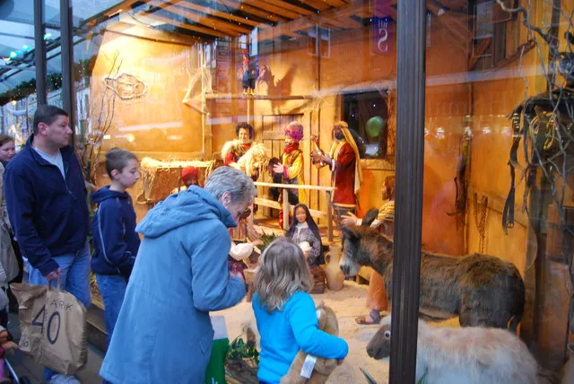
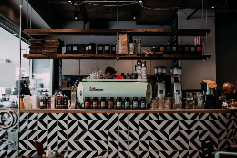
Photo: independent shop entrance display decompression zone UK retail interior, via logolook.net
Putting the bestseller by the door is one of those retail rules that sounds sensible until you watch customers actually do it. They walk in, clock a table of your top-selling candle, step around it and keep moving. Sometimes they do not stop at all. The product was not the problem. The position was.
I know why shops do it. The bestseller is safe. It is the thing you are proud of. It has the best margin, the best story or the best chance of selling. So it goes in the window and on the first table inside, because that is where the customers are. Except that is not quite how people enter a shop.
What the decompression zone actually means
The decompression zone is the first stretch of floor inside the door. Plain English: it is the bit where customers adjust. They have come in from a noisy pavement, a bus, a rain shower or a phone call. Their eyes need a moment to change focus. Their brain is still half outside. They are not ready to be sold to at full volume.
In most independent shops this zone is roughly the first two metres, though it shifts with the size of the unit and the speed of the street outside. It is not dead space. It is transition space. The mistake is filling it with product and calling it prime selling space.
When the first thing a customer meets is a dense display, a dump bin or a rail of coats, the shop asks them to make a decision before they have worked out where they are. Some will. Most will do the polite retail shuffle: look, step sideways, drift towards the back and start browsing properly somewhere else. The bestseller by the door has not sold anything. It has just acted as a traffic cone.
Why your bestseller can wait
A bestseller is usually best known to your regulars. They will find it. New customers need something different from the first two metres: orientation, atmosphere and a reason to slow down. If you put your hero product there, you are using your most valuable transition space to repeat information that your layout should be giving anyway.
There is also a positioning problem. A bestseller by the door can flatten the rest of the shop. Customers see the thing they already know, decide they have seen the shop, and leave without exploring. Or they see a cheap impulse line first and assume the whole shop is cheaper than it is. Or they see a high-priced item with no context and back away. The first metres set the tone. They should not be a product dump with a price sticker.
I would rather use that space to slow people down. Not block them. Slow them. There is a difference.
Slow, do not stop
A good decompression zone gives the eye somewhere to land and the body somewhere to go. Think low table, single statement, open floor, a change of light, a texture underfoot, a clear view through to the back. It can be visual merchandising without being a pile of stock.
Try one idea rather than five. A single fixture with space around it. A low display that does not interrupt the sightline. A swatch of colour that echoes the window but does not repeat it. A simple sign with a reason to walk further in. The job is to make the customer feel they have arrived somewhere, not to make them decide in the first three seconds.
On a narrow high-street unit, this is especially important. Many British shops are long and thin, often in older buildings with a doorway that opens straight into the selling space. If you put an island in the middle of the entrance, you create a bottleneck. If you put a rail across the front, you create a wall. The fix is usually to keep the centre clear, use the walls and angle the first fixture so it invites people in rather than stopping them.
Practical fixes for narrow UK shops
Start by watching ten customers cross the threshold. Do they pause? Do they turn left or right immediately? Do they walk straight to the counter and ask for something? Do they leave without touching anything? If the first two metres are doing their job, you will see a small moment of adjustment before the browsing begins.
Then try one change at a time. Move the bestseller from the door to the first natural stopping point further in, often a side wall or a mid-shop bay. Keep the entrance clear enough for a pram and a wheelchair. Lower the first display so it does not block the view of the back wall. Use the window to do the loud selling, and let the interior do the welcoming. Put the till where it can see the door without guarding it.
A small shop does not need a grand entrance. It needs a clear one. The bestseller will still sell. It may sell better when customers have had a moment to arrive.